Branding EZ Permits & Inspections is a company providing services related to building permits and inspections. The company contacted us to create their branding, logo, and website. We decided to create a brand that would be easy to remember and would have a specific direction.
Generate confidence with a color that brings stability
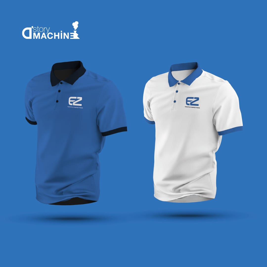
Use blue as a calming tone to provide relaxation and credibility
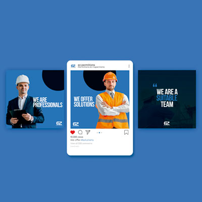
Make their content more vibrant and appealing
An easy way for people to recognize EZ Permits and Inspections
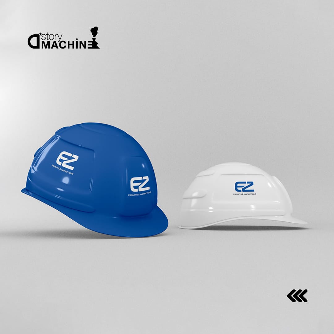
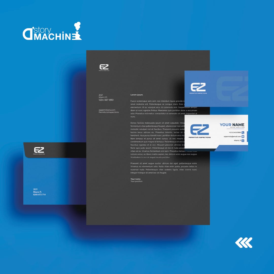
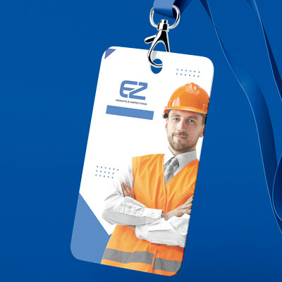
After deciding on the colors, we started creating graphics that would match each other and set up a color scheme for the company’s branding. Like the color palette, the logo is an important part of their branding. The logo we created for them has a superimposed E and a Z, following the shape of the E. Thus, generating a balance between the negative spaces of the logo which reflects the stability and confidence we were looking for in the company.
EZ Permits & Inspections now has an identity that makes them stand out, making them happy with the results. • A strong and professional identity for the company • Make a great first impression with customers and stakeholders • Be more memorable in the market • Increase brand awareness
The new brand identity for EZ Permits & Inspections will help them stand out in a competitive industry and reach their goals. And it seems like they have found just what everyone needs in this new design. Not only making them stand out from the rest of the companies, but also giving off an air of reliability so customers will feel like the company is as professional as their image shows.
NEED HELP?
We want to make your experience with us a great one. If there's anything we can do for you, please don't hesitate in reaching out!